The co-op features in the December 2003 issue of Domus magazine. Text by Tanya Harrod, photography by Phil Sayer.
View the PDF (460 kb) of the article ‘Working on utopia’
Article text (English section)
Working on utopia
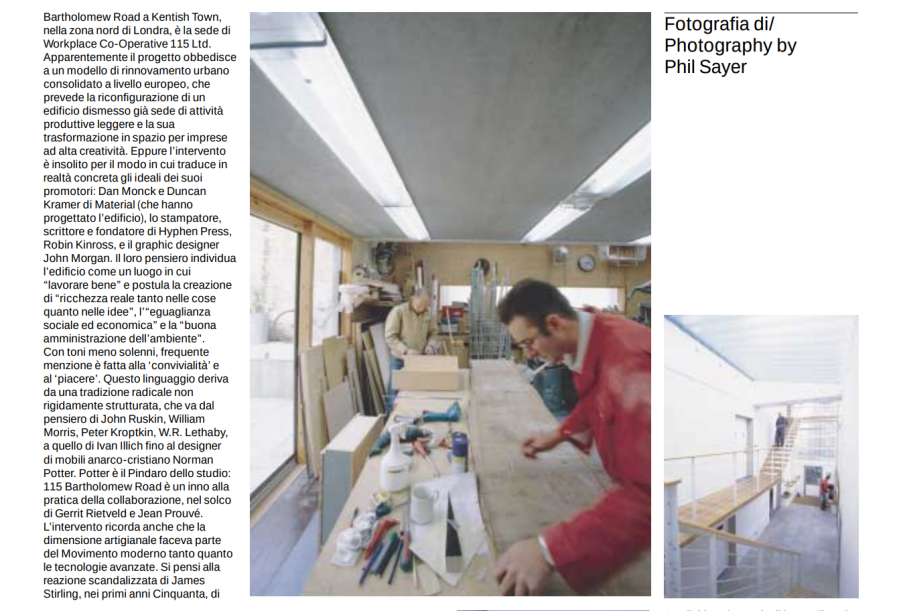
Bartholomew Road in Kentish Town, north London, is the home to Workplace Co-operative 115 Ltd. As a project it falls into a recognizable European pattern of urban renewal in which a derelict light industrial building is reconfigured as a creative space. But it is unusual because of the way in which it reifies the ideals held by its initiators, Dan Monck and Duncan Kramer of Material (who designed the building); the typographer, writer and founder of publishing imprint Hyphen Press, Robin Kinross; and the graphic designer John Morgan. Their thinking, set out in various manifesto-like statements, identifies the building as a place for ‘good work’, the creation of ‘real wealth in both things and ideas’, ‘social and economic equality’ and ‘good stewardship of the environment’. Less solemnly, frequent mention is made of ‘conviviality’ and ‘delight’. The language derives from a loosely connected radical tradition, taking in John Ruskin, William Morris, Peter Kroptkin, W. R. Lethaby, Ivan Illich and the Christian anarchist furniture designer Norman Potter. Potter is the Pindar of the studio, and 115 Bartholomew Road is a hymn to workshop practice in the tradition of Gerrit Rietveld and Jean Prouvé. It also reminds us that an artisanal approach was as much a part of the modern movement as advanced technology. Cue to James Stirling’s shocked response to the low-tech nature of Le Corbusier’s Maison Jaoul being constructed with ‘ladders, hammers and nails’ in the early 1950s. The phrase ‘modern movement’ needs to be brought in early. There is plenty of bland minimalist architecture that pays lip service to heroic early modern architecture. But 115 Bartholomew Road is different. At first sight, approached from the genteel terraces of Leighton Road, it announces itself as a bold problem-solving exercise, standing on the footprint of a partly demolished pair of buildings. The façade onto the street is divided in classical fashion with a rusticated ground floor of London stock bricks, a triple-height glass-and-steel screen looking onto a small courtyard and a robust steel gate. The first and second floors convey the sense of a modernist piano nobile with fenêtres en longueur and angled tiers of insulated, naturally white rendered panels.
We enter from the street into the ghost of the old alley that divided the original buildings. This now a steel-and-Reglit-glazed atrium three stories in height. From the street this generous use of glazing signals modernist transparency, both literally and metaphorically. Inside it functions rather like a brightly lit Norman chancel with the workspaces grouped around it. This is the building’s public space, intended for encounters, talk and shared exhibitions. Here, if not before, we begin to appreciate the extraordinary sensitivity to materials and workmanship. There are no off-the-peg solutions – unless we count the sourcing of a sprung hinge used in Japanese telephone boxes.
The cultural capital invested in process and in truth to materials and structure might easily pass unnoticed. The building belongs, therefore, to the elite culture of modernism. Its sensibility, a kind of conspicuous visual parsimony for the initiated, is reminiscent of the discreet understatement that characterizes recent Swiss buildings, the most apt being Peter Zumthor’s Hotel Therme at Vals in the Grisons. But the general effect is more handmade, more direct. Monck and Kramer did not have access to a highly skilled Swiss labour force, nor did they have Zumthor’s budget. Instead the building and the spirit of the co-operative remind us that ‘real wealth’ resides in ideas. Then again, the construction drawings for this building were mostly handwork, which is why we experience the architecture of humanism rather than the very unpleasant sensation of being inside a CAD rendering.
Monck and Kramer’s sensibility expresses itself through wall and floor materials – the hallway is finished in natural white plaster while the workspaces are dry-lined with plywood panels. Floors are power-floated blue-grey concrete with services concealed under a surround of phenolic-faced plywood. Care and attention have been paid to light switches and intercom panels. The shades for the fluorescent top lighting have been painstaking adapted from the Reglit glazing panels used in the hall. The main staircase in the entrance hall and a smaller version in the double-height workshop at the back of the building are exquisitely crafted from steel and wood.
And it is detail that teaches us about the construction of the building. All of the internal walls are constructed from the cheapest concrete blocks. We discover this because they are chamfer-cut and left exposed to create terrazzo-like doorway surrounds. Similarly, all of the new external walls are timber-framed, something we guess from observing the framing of the fenestration. The pre-cast concrete slabs that make up the intermediate floors are left exposed as ceilings on the ground and first floors. Characteristically, Duncan Kramer of Material went to great lengths to find examples of beautifully cast concrete slabs. Plasterboard, as a kind of second-order material, is avoided whenever possible.
The construction is unusual but serves to make the building very quiet and stable as regards temperature. Quietness is important when a workshop with metal and woodworking machinery abuts a publisher’s office.
The workspaces are central to the success of a building like this – along, of course, with the ‘not-for-profit’ management and resulting low rents. At present the building accommodates 14 individuals in seven workspaces, each of which has a character of its own.
For instance, there are two very different double-height spaces on the ground floor, which contrast with a more vernacular space with a low sloping ceiling on the first floor and with a dramatic long room spanning the length of the building on the second floor. They are all full of character – as good for musing as for intensive activity, places of softly lit, warm calm that contrast strikingly with the inside/outside brightness of the entrance hall.
The building is more than a sum of its parts. A shared kitchen looking onto the street brings the occupants together informally and, once a week, formally. Its generous size underlines the liberality of the entire project. This is not the typical run-of-the-mill communal building refurbished for ‘creatives’. It is something quite different, closer in spirit to an informal university, a place of mutual aid where good work will surely be accomplished.